How data sampling affects the Fourier transform periodogram
The Fourier transform and related (e.g., Lomb-Scargle) periodograms are incredibly valuable tools for transforming and interpreting data. I am typically concerned with using the periodogram to detect and characterize variations in time series data, such as recorded brightnesses of stars. I will demonstrate four key considerations for understanding how the qualities of your data affect the representation of signals in the periodogram.
For a deeper dive on the statistical considerations for the Fourier-based Lomb-Scargle periodogram, see “Understanding the Lomb-Scargle Periodogram” from Jake VanderPlas. Pyriod is a Python package I wrote for interactive Fourier analysis of time series data in a Jupyter notebook. The following are essential considerations for performing such an analysis reliably.
Some preliminaries
The Fourier transform periodogram can be thought of as essentially representing the best-fit amplitudes of sinusoids fitted to some data with many different test frequencies. Sometimes the periodogram is displayed in terms of power (or power density), but I prefer best-fit amplitude versus frequency.
Here I am thinking primarily about time series data collected with regular periodic time sampling, with a new observation made every \(\Delta t\) seconds or days. This will produce the most readily-interpretable dataset with fairly straightforward Fourier behavior, such as a well-defined Nyquist frequency. Understanding how to interpret a periodogram of evenly sampled data is an essential preliminary for understanding any unevenly sampled data.
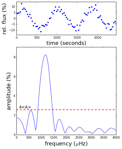
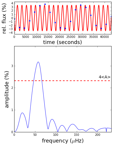
An important aspect of Fourier analysis is separating signals of interest from the noise. Time series measurements will each have some random measurement errors. If this noise is uncorrelated and similar throughout the data set, the contribution of noise to the periodogram will be a noise floor of peaks distributed across all sampled frequencies. The peaks will follow some distribution (\(\chi^2\) with two degrees of freedom if the noise is Gaussian) that falls off exponentially to high amplitude, so it’s unlikely for the noise in your data set to produce a peak that is “very tall.” A very tall peak is more likely to represent a real signal, and we might interpret peaks that rise above some significance threshold in the periodogram to be real signals we wish to analyze. Where to set such a threshold depends on your data and the problem at hand. Often it is defined as some factor above the average peak height (noise level; \(\langle A\rangle\)) in the periodogram. For demonstration purposes, these examples show a threshold four times above the average amplitude in the periodogram, 4\(\langle A\rangle\).
Signal-to-noise
The periodogram is powerful for its ability to reveal periodic signals in noisy data that can’t be seen by eye. This is especially true when you have a lot of data spanning many cycles of variations. To show how the sensitivity to low-amplitude signals improves as more data are collected, this animation shows the evolution of a simulated noise-dominated time series (top) and its Fourier transform (bottom).
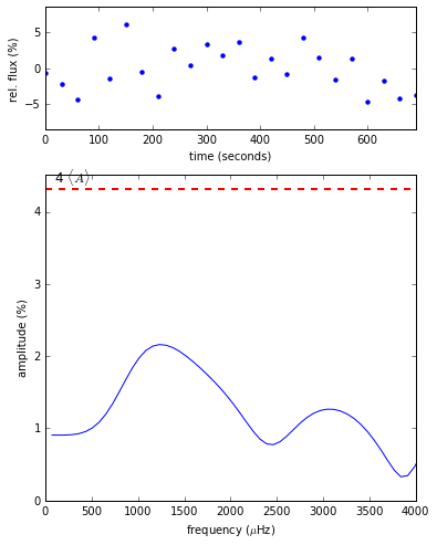
Initially, all periodogram peaks have similar heights representing that the data are consistent with white noise, with none rising above the 4\(\langle A\rangle\) significance threshold. As more data are collected, the noise peaks decrease in amplitude and the significance threshold lowers until one peak is revealed to rise significantly above the rest. As more data are collected (\(N\) data points), the average noise level decreases as \(1/\sqrt{N}\), and the signal-to-noise ratio increases as \(\sqrt{N}\).
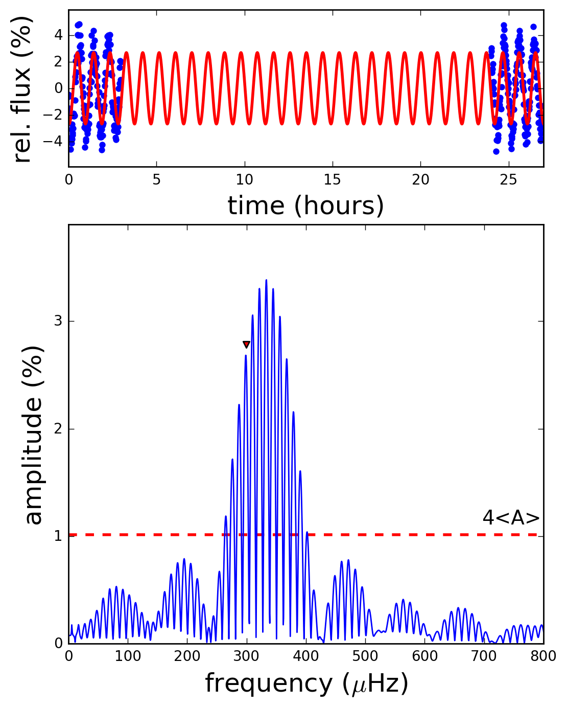
Frequency resolution
You’ll also notice in the animation above that the peaks get narrower as more data are collected. The frequency resolution goes as \(1/T\), where \(T\) is the total length of the time series. With continuous, evenly sampled data, a coherent sinusoidal signal will have the appearance of a (sinc function) in the amplitude spectrum, with the peak dropping to zero at every multiple of \(1/T\) from the center of the peak. Under these conditions, periodogram values separated by multiples of \(1/T\) are not correlated and are said to be “independent” of each other. Periodograms are typically computed for a set of test frequencies that are spaced by at most \(1/T\) so that no significant peaks are missed.
If two signals are closer to each other than the frequency resolution, they will appear as one peak until enough data are collected to resolve them. This animation shows how the periodogram of a simulated data set with two closely spaced frequencies evolves as more data are collected.
When the time baseline \(T\) is too short to resolve these two signals, they appear as just one wide peak in the periodogram. As more data are collected, eventually the resolution gets smaller than the frequency difference, and the unresolved peak splits into two to reveal the two signal frequencies.
Having two signals with similar frequencies is the situation where we get the beating phenomenon. Superimposing these two sine waves with slightly different frequencies, the phase difference between the signals will slowly evolve, alternating between times of constructive and destructive interference. This is visible as the envelope of variability amplitude seen in the time series plot (the sum of underlying signals is shown in red at the end of the animation). The frequency of amplitude modulation from beating is the beat frequency \(f_{beat} = \lvert f_1 - f_2\rvert \). The condition for resolving the peaks is that you observe at least one full beat cycle with an observing duration exceeding \(1/f_{beat}\). Before the peaks are strictly resolved, the shape of the peak will appear distorted from a sinc function, revealing that you’ve got more than just a single coherent sinusoid, but you won’t be able to pin down exactly what frequencies are involved unless you resolve them.
Nyquist aliasing
Do the peaks in the periodogram appear at locations of their accurate intrinsic frequencies? This depends on whether the time series is sampled rapidly enough that the intrinsic frequency is below the Nyquist frequency. The Nyquist frequency is \(1/(2\Delta t)\), where \(\Delta t\) is the time spacing between evenly sampled data points. The Nyquist frequency is only well defined for evenly sampled data, and if you compute the periodogram beyond the Nyquist you’ll just see a mirror image of the periodogram peaks below the Nyquist limit (no added information).
In this animation, the red is the true underlying signal, and the blue points are the data, initially sampled fewer than twice per cycle. See how the undersampled data still look sinusoidal, just with a lower frequency? The peak that appears below the Nyquist limit is the lowest-frequency interpretation of the data, but there is actually an infinite set of specific higher frequencies that could also potentially explain the data. As the sampling rate is increased, the Nyquist frequency that I compute the periodogram out to increases. The peak bounces around basically as an optical illusion until it settles down when its intrinsic frequency is below the Nyquist. See this post for more detail about Nyquist aliasing: Nyquist analysis and the pyquist module.
Of course, we generally cannot change our time sampling in the analysis stage as shown in the animation. Instead, it is best to evaluate the fastest potential timescale of variation that could be in your data and to design the data acquisition to collect the data at a rate at least twice as fast. If sufficiently rapid sampling to ensure signals are below the Nyquist frequency is not practical, then the interpretation of the data should include considerations that the intrinsic frequencies may be above the Nyquist.
Aliasing from gaps in the data
In Nyquist aliasing (above), a single signal in the time series could be interpreted as having one of a number of discrete underlying signal frequencies (aliases) because of the how the data are sampled. When there are gaps in the time series data, this also can produce a discrete set of aliases for the underlying frequency because of uncertainty about exactly how many periods of variation were missed when you weren’t collecting data. When you have large gaps in the data, each individual sinusoidal signal will show up as a comb of frequencies, each representing a potential explanation for the observations that were collected. The animation below shows the best-fit sinusoid matching each of the tallest alias peaks, and you see that the model phases up to the collected data, but with different numbers of cycles in between the two sets of observations.
This is a situation that comes up often in astronomy, where observations may be collected from a telescope for a while when a target is observable in the night sky, and then again the next night, with a gap in the intervening daytime. The spacing between the peaks in the comb is \(1/(\Delta T)\), where \(\Delta T\) is the spacing between sets of observations on either side of the gap. The broader envelope that these peaks fall within is the sinc function corresponding to the duration of the individual, continuous sets of observations. With gaps in noisy data, there is great risk of choosing the wrong alias, fitting a sinusoid with small formal uncertainties on signal frequency, and being completely wrong. All statistically viable aliases should be considered.
Final thoughts
Real data sets can be much more complicated than the simple examples here, but can mostly be understood by extending the intuition that these examples provide. Of course, this doesn’t capture everything, especially that not all signals are coherent, unwavering sinusoids.
These graphical examples demonstrate consequences of the convolution theorem for the Fourier transform, which states that products in the time domain are convolutions in the frequency domain. A data set is a product of the underlying signal and the sampling function (called the window function—a record of when observations were made). This is why the details of how the observations are distributed in time affect the resulting periodogram so much, and planning the observations to produce an interpretable periodogram is a critical aspect of experimental design. The Fourier transform of the window function produces the so-called spectral window. It is always worth inspecting the spectral window of your data to understand what signals will look like in the periodogram and what kind of aliasing can be expected.

Astronomy, statistics, programming in Python, data visualization, data science, and other great icebreakers.
- Bootstrapping a significance threshold for periodogram analysis
- How data sampling affects the Fourier transform periodogram
- Three statistical tests for average spacing among numbers
- Confidence intervals for 2D Gaussian mixture models with contours
- What's the expected average value of a noisy amplitude spectrum?