Fitting features in a power spectrum with least squares and MLE
I have come to confess my statistical sin. I have used least squares to fit features in the power spectra of variable stars. In particular, I believe I was the first to use least squares to fit Lorentzians to the signals from incoherent pulsation modes in the power spectrum of a pulsating white dwarf star observed by the Kepler spacecraft. This has rightfully alarmed some colleagues, since least squares intrinsically assumes that measurement noise is Gaussian (normally) distributed, which is emphatically not true of noise in a power spectrum. I explore here what effect this might have on the best-fit parameters returned by this technically invalid method. I also demonstrate how to treat the statistics more appropriately with maximum likelihood estimation (MLE).
First, how is noise in a power spectrum distributed? This problem is a bit specific to my research domain, but the statistical lessons are useful more broadly, so I’ll take a moment to roughly outline how this arises.
A power spectrum can be used to represent the frequency content of a time series. For instance, the frequencies that a star oscillates at can be used to map the star’s interior structure, and we might measure these frequencies by computing the Fourier transform or Lomb-Scargle periodogram of a record of the star’s brightness over time to determine what frequencies there is “power” at. If you really want to understand the details, I recommend the paper “Understanding the Lomb-Scargle Periodogram”. Briefly, the power spectrum is measured at a large number of frequency samples where power could be present. For each tested frequency, the best-fit amplitudes of both a sine and cosine wave are determined with least squares (Gaussian uncertainties are assumed on the time series data). The uncertainties on these amplitudes are each Gaussian distributed. Fitting both a sine and cosine wave at each test frequency is equivalent to fitting a single sinusoid with a phase term. The power (amplitude squared) at each frequency is equal to the sum of the squares of the sine and cosine amplitudes. If the only power at a given frequency is due to noise or a stochastic (incoherent) signal, the sine and cosine amplitudes are random deviates drawn from Gaussian distributions, and the underlying distribution of the sum of the squares of Gaussian random deviates is described by a \(\chi^2\) distribution. Specifically, since we are summing the squares of two Gaussian deviates, power is distributed as \(\chi^2\) with two degrees of freedom, i.e., \(\chi^2_2\). This distribution is a simple exponential decay, \(\chi^2_2 \propto e^{-x/2}\). Let’s use scipy to inspect this distribution.
import numpy as np
import matplotlib.pyplot as plt
from scipy.stats import chi2

#Plot probability density distribution
xsample = np.linspace(0, 8, 50)
pdf = chi2.pdf(xsample, df=2)
plt.plot(xsample, pdf, lw=4, c='b')

#Plot histogram of random variates
rvs = chi2.rvs(df=2, size=10000)
plt.hist(rvs, bins=np.arange(0,8.1,0.2), density=True, ec='k')

#Display
plt.xlabel('x')
plt.xlim(0, 8)
plt.ylabel(r'$\chi^2_2$')
plt.ylim(0)
plt.tight_layout()
plt.show()
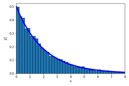
Simple enough… but we can immediately see the problem with fitting such data using least squares. Fits obtained with least squares do as advertised, they minimize the sum of the squares of the residuals, intrinsically assuming that the noise is Gaussian distributed. The \(\chi^2_2\) distribution is very different. Qualitatively, the highest density of samples from a Gaussian distribution is likely to be found near the mean value, decaying symmetrically as you move away in either direction, while the highest density of samples from a \(\chi^2_2\) distribution will be near zero, with no negative values but occasional large positive values permitted in the exponential tail. We can imagine that there will be trouble if we fit \(\chi^2_2\)-distributed data under the incorrect assumption that it is Gaussian distributed, but we won’t let that stop us.
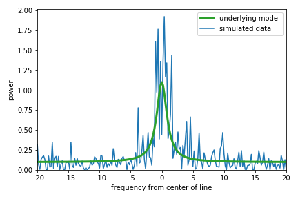
Without going into too many details, in my field of asteroseismology we often encounter oscillations that are stochastically driven/damped, the signature of which in the power spectrum is power \(\chi^2_2\)-distributed about a Lorentzian function.1 This Lorentzian sits atop a (let’s assume flat) background. There are four parameters that we might be interested in: the central frequency, height, and width of the Lorentzian, and the height of the background. The center and width are of perhaps the greatest physical interest, because these represent a fundamental vibrational frequency of the star and the inverse lifetime of the oscillation, respectively. Let’s see what this simple model looks like. Below I show the underlying (“limit”) spectrum, and one realization of the power that might be measured from such a system.
#Functions describing the model
def lorentzian(x, x0, a, gam):
    return a * gam**2 / ( gam**2 + ( x - x0 )**2)

def offsetlorentzian(x, params):
    """Lorentzian plus an offset

    params is a list of four values:
     - background height
     - central frequency
     - Lorentzian height
     - full-width at half-maximum

    x is frequencies to evaluate the model at
    """
    return params[0] + lorentzian(x, params[1], params[2], params[3])

#Set underlying values for our model
freqsample = np.linspace(-20, 20, 201)
params = [0.1, 0, 1, 1] #[offset, center, height, fwhm]
underlying = offsetlorentzian(freqsample,params)/2.
plt.plot(freqsample, underlying, lw=3, c='C2', label='underlying model')
#Generate random deviates distributed as Chi^2_2 about this model
data = underlying*chi2.rvs(2, size=freqsample.size)
plt.plot(freqsample, data, zorder=-1, label='simulated data')

plt.legend()

plt.xlim(-20, 20)
plt.xlabel('frequency from center of line')
plt.ylim(0)
plt.ylabel('power')
plt.tight_layout()
plt.show()
The random data are exponentially distributed (\(\chi^2_2\)) about the underlying model as seen above, with a few peaks at large power taken from the tail of the distribution. If we try to fit the Lorentzian plus offset model with least squares, the algorithm will try to find the parameters that produce residuals (the difference between the data and the model) that are distributed in the most Gaussian way. Let’s do that fit to the data above and include the result on the plot.
from scipy.optimize import leastsq

#Function to get the residuals
def residuals(params, x, y):
     return offsetlorentzian(x,params) - y

#Fit with least squares, using underlying values for first guess
popt, ier = leastsq(residuals, params, args=(freqsample, data))
plt.plot(freqsample,offsetlorentzian(freqsample,popt), lw=3,
         label='least squares fit')
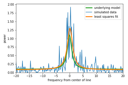
The results in this case don’t really look too bad considering that these data are intrinsically noisy. That’s a bit of a relief, but this is just one realization of such data. Let’s simulate a bunch and see how the results look overall.
#Run a ton of simulations
nruns = 10000
#Prepare to collect the results
results = np.zeros((nruns,4))
#Keep track of any fits that don't converge
bad = np.zeros(nruns)
#Simulate and fit
for i in range(nruns):
    data = underlying*chi2.rvs(2, size=freqsample.size)/2.
    popt, ier = leastsq(residuals, params, args=(freqsample,data))
    if ier == 1: #Did the fit converge?
        results[i,:] = popt
    else:
        results[i,:] = np.nan
        bad[i] = 1

#Remove redults from unconverged fits
results = results[np.where(bad == 0)[0],:]
#Take the absolute value of the width parameter
results[:,-1] = np.abs(results[:,-1])
And let’s plot a handful for initial inspection.
#Plot the underlying model
plt.plot(freqsample, underlying, lw=2, c='C2', label='underlying model')

#Define a higher frequency sampling for display purposes
osamplefreq = np.linspace(-20,20,1001)

#Plot some example best-fits obtained with least squares
for i in range(100):
    plt.plot(osamplefreq, offsetlorentzian(osamplefreq, results[i,:]),
             lw=1, c='k', alpha=0.2, zorder=-1)

plt.xlim(-5, 5)
plt.xlabel('frequency from center of line')
plt.ylim(0, 15)
plt.ylabel('power')
plt.tight_layout()
plt.show()
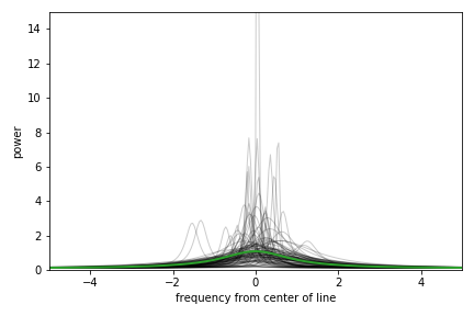
We see that overall many of these fits appear to trace roughly over the underlying model, but also that many fits end up especially tall and narrow. This is what happens when the data are dominated by a single value drawn from the tail of the exponential \(\chi^2_2\) distribution. To minimize the sum of the squared residuals, the algorithm would rather fit these single large spikes at the expense of missing the wider feature of interest. So, we have identified a specific failure mode of this approach, which is no surprise because we’re butchering the statistics. We can roughly separate out the fits that latched on to one narrow peak versus those that tried to fit the power excess overall by inspecting the width parameter of these “best” fits. Here’s a histogram of the full-widths at half-maximum found by least-squares.
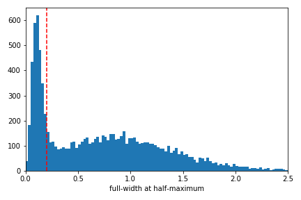
This distribution appears multi-modal: the failure mode identified above produces an excess of narrow fits when the algorithm fits a single large spike, and otherwise a broad fit is obtained to represent the excess power that is distributed across many sampled frequencies. I have drawn a line that crudely separates these solutions at 0.2, which is the spacing between independent frequency samples in the simulation. For the power spectrum of a continuous time series, power is independently sampled at frequencies separated by the inverse of the time series length. With these two types of solutions roughly separated, I like to look at a corner plot that displays the correlations between all pairs of fit parameters as follows.
import corner

#Separate narrow and wide solutions
separator = 0.2
res1 = results[:,-1] > separator #wide
res2 = results[:,-1] < separator #narrow

#Corner plot the two types of solutions
labels=['offset','center','amplitude','fwhm']
ranges = [[0.08,0.4],[-2.5,2.5],[0,16],[0,3.2]]
bins = [np.arange(0.08,0.41,.01),
       np.arange(-2.5,2.6,.2),
       np.arange(0,20.1,1),
       np.arange(0,4.1,.2)]

#Bad fits
figure = corner.corner(results[res2,:], labels=labels, bins=bins,
                       truths = params, range=ranges, show_titles=False,
                       color='red', hist_kwargs={'zorder':5})
#Good fits, with summary stats in title
figure = corner.corner(results[res1,:], labels=labels, bins=bins,
                       truths = params, range=ranges, show_titles=True,
                       color='black', fig=figure)

plt.show()
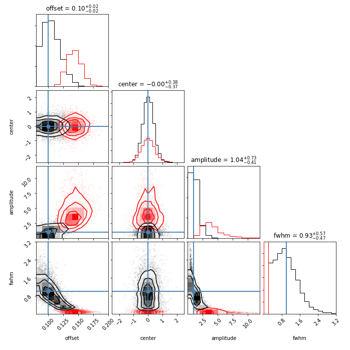
Here the best-fit parameters from the narrow least squares fits are displayed in red, and the broader fits are in black. The true underlying values used to simulate the data are marked by the blue lines. The summary statistics giving the median and inner 68% confidence intervals in the titles are for the wider fits. Inspecting the red distributions, it’s clear that the offsets, amplitude, and widths returned are all dramatically biased (the offset in particular is mopping up some of the excess power), and the central locations of the Lorentzians suffer a loss of precision. The only good news is that, if you fit such data with least squares and you visually inspect your fits carefully to make sure you’re not falling into the trap of fitting only one narrow spike of a wider feature, you likely are obtaining parameters that reasonably approximate the underlying values. But that’s a lot of ifs, and why would you put yourself through that? The answer to why I’ve done this in the past is that programmatically it’s a one-liner. The hidden cost is that years later the guilt will cause you to write a lengthy blog post exploring the ramifications.
The truth is that it’s fairly straightforward to obtain a fit with an appropriate treatment of the statistics, so let’s close with that. There are two approaches that are commonly used: maximum likelihood estimation (MLE) and Markov Chain Monte Carlo (MCMC).2 I’ll focus on the former, as it is identical to the least squares algorithm under the assumption of Gaussian distributed measurement errors.
Each measurement in our power spectrum is drawn from a \(\chi^2_2\) distribution centered about the underlying limit spectrum, which is our Lorentzian plus offset model. The probability density of obtaining any value \(O_i\) at frequency index \(i\) is (following Anderson, Duvall, & Jefferies, 1990, ApJ, 364, 699):
\[P_i(O_i) = \frac{1}{\langle O_i \rangle}\exp{\frac{-O_i}{\langle O_i \rangle}} ,\]
where \(\langle O_i \rangle\) is the value of the underlying limit spectrum, i.e., the underlying model. The likelihood of acquiring all of our data given our model for how the data are generated is the product of the probabilities of getting each measurement. If we call all of our observations \(\vec{O}\), we can write the likelihood as
\[L(\vec{O}) = \prod_{i=1}^{n} P_i(O_i). \]
MLE is a method to determine the parameters of the underlying model for which our actual data are most likely. The values that maximize the likelihood expression above also maximize the log likelihood, which conveniently turns our product into a sum, and because many minimization routines are readily available, we often aim to minimize the negative log likelihood. The negative log likelihood for our problem is
\[-\ln{L(\vec{O})} = \sum_{i=1}^{n} \ln{\langle O_i \rangle} + \frac{O_i}{\langle O_i \rangle}. \]
Let’s throw this at an optimizer to estimate the parameters that
generate the maximum likelihood (minimum negative log likelihood),
just like how least squares minimizes the sum of the squares of the
residuals. You’ll see it’s really just as easy, except we use the
likelihood expression instead of the residuals function above, and use
SciPy’s minimize function instead of leastsq, which is called the
same way.
from scipy.optimize import minimize

#For MLE, minimize the negative log likelihood
def neglnlike(params, x, y):
    #h/t James Kuszlewicz
    #Data generated as Chi^2_2 about a Lorentzian plus offset
    model = offsetlorentzian(x, params)
    output = np.sum(np.log(model) + y/model)
    #Check that this is valid, returning large number if not
    if not np.isfinite(output):
        return 1.0e30
    return output

res = minimize(neglnlike, params, args=(freqsample, data),
              method='Nelder-Mead')
Here’s the MLE fit plotted over the same simulated data as above, with the least-squares fit also displayed.
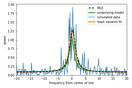
The results from MLE and least squares are pretty similar in this case, but this is one of the friendly realizations where least squares doesn’t overfit a single peak in the power spectrum. Let’s run it 10,000 times and see how MLE does when we throw many realizations of the data at it.
#Also run a ton of simulations for the MLE treatment
nruns = 10000
#Prepare to collect the results
mleresults = np.zeros((nruns,4))
#Keep track of any fits that don't converge
mlebad = np.zeros(nruns)
#Simulate and fit
for i in range(nruns):
    data = underlying*chi2.rvs(2, size=freqsample.size)/2.
    res = minimize(neglnlike, params, args=(freqsample, data),
              method='Nelder-Mead')
    if res.success: #Did the fit converge?
        mleresults[i,:] = res.x
    else:
        mleresults[i,:] = np.nan
        mlebad[i] = 1

#Remove results from unconverged fits
mleresults = mleresults[np.where(mlebad == 0)[0],:]
And here’s the corner plot for the parameters obtained from MLE:
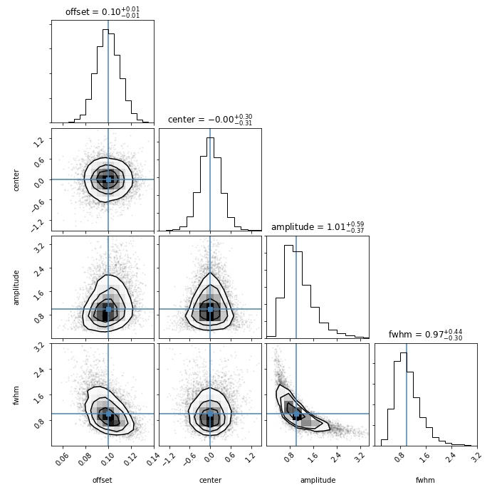
Nailed it! Over many realizations of random noise, the MLE parameters are distributed around the true underlying values that I used to generate the data. Finally, let’s compare the distributions for each parameter obtained by MLE (black) and least squares (red) directly.
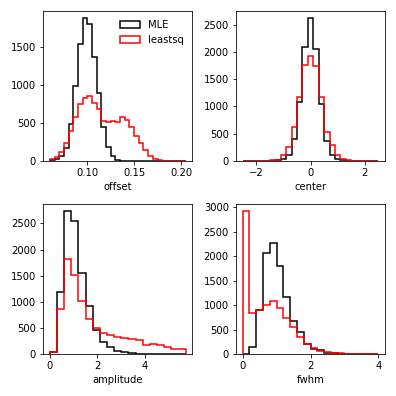
Clearly the MLE approach does not fall into the trap of overfitting single high peaks in the power spectrum, thanks to properly accounting for the fact that a small number of high peaks are expected to show up from the tail of the exponentially decaying \(\chi^2_2\) distribution that the data are generated from. The fits resulting from MLE are overall more precise and accurate. That said, if least squares converges to fit the feature that you’re aiming for and you verify this by carefully inspecting your fit to the data and its residuals, you might not be in hopeless shape. However, since you’ve read this, there’s no excuse to go out and do a silly thing like that now, is there?
1: See, e.g., Section 3.7.5 of the textbook “Asteroseismology” or Secton 5.3 of “Asteroseismic Data Analysis: Foundations and Techniques”.
2: My buddy James Kuszlewicz wrote a very instructive notebook about how to use both of these methods to fit pulsation signatures in power spectra, available here. See also Secton 6.3 of “Asteroseismic Data Analysis: Foundations and Techniques”.
Astronomy, statistics, programming in Python, data visualization, data science, and other great icebreakers.
- Bootstrapping a significance threshold for periodogram analysis
- How data sampling affects the Fourier transform periodogram
- Three statistical tests for average spacing among numbers
- Confidence intervals for 2D Gaussian mixture models with contours
- What's the expected average value of a noisy amplitude spectrum?