High-fidelity plot image representations for machine learning classification
As computers become faster and data sets grow larger, machine learning is playing an ever increasing role in astronomy research. One application that I find very compelling is in the field of stellar pulsations, where Marc Hon has led advancements in “Detecting Solar-like Oscillations in Red Giants with Deep Learning” based on image representations of their data; specifically, their classifier can determine whether (and where) solar-like oscillations are present in a power spectrum plot. Here I detail one contribution I’ve made to this work that might be helpful for other image-based classification efforts: I present code that can turn a line plot into a 2D numpy array representation that is fast and aims to preserve fidelity of the original data. This aspect of machine learning is called “feature engineering” and is concerned with providing the most informative data that a classifier can use to base decisions on. This is the area where domain knowledge really gives the astronomer an advantage over the generic data scientist.
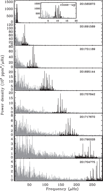
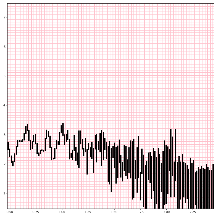
A power spectrum represents how much the brightness of a star is observed to vary at different frequencies. This is based on long recordings of the brightness of stars over time, called light curves. Solar-like oscillating stars vary most near a characteristic frequency that is lower for puffier stars. In the series of power spectrum plots below from Stello et al. (2015, ApJL, 809, L3), the darkened oscillation signals appear at higher frequencies for less evolved, more compact stars.
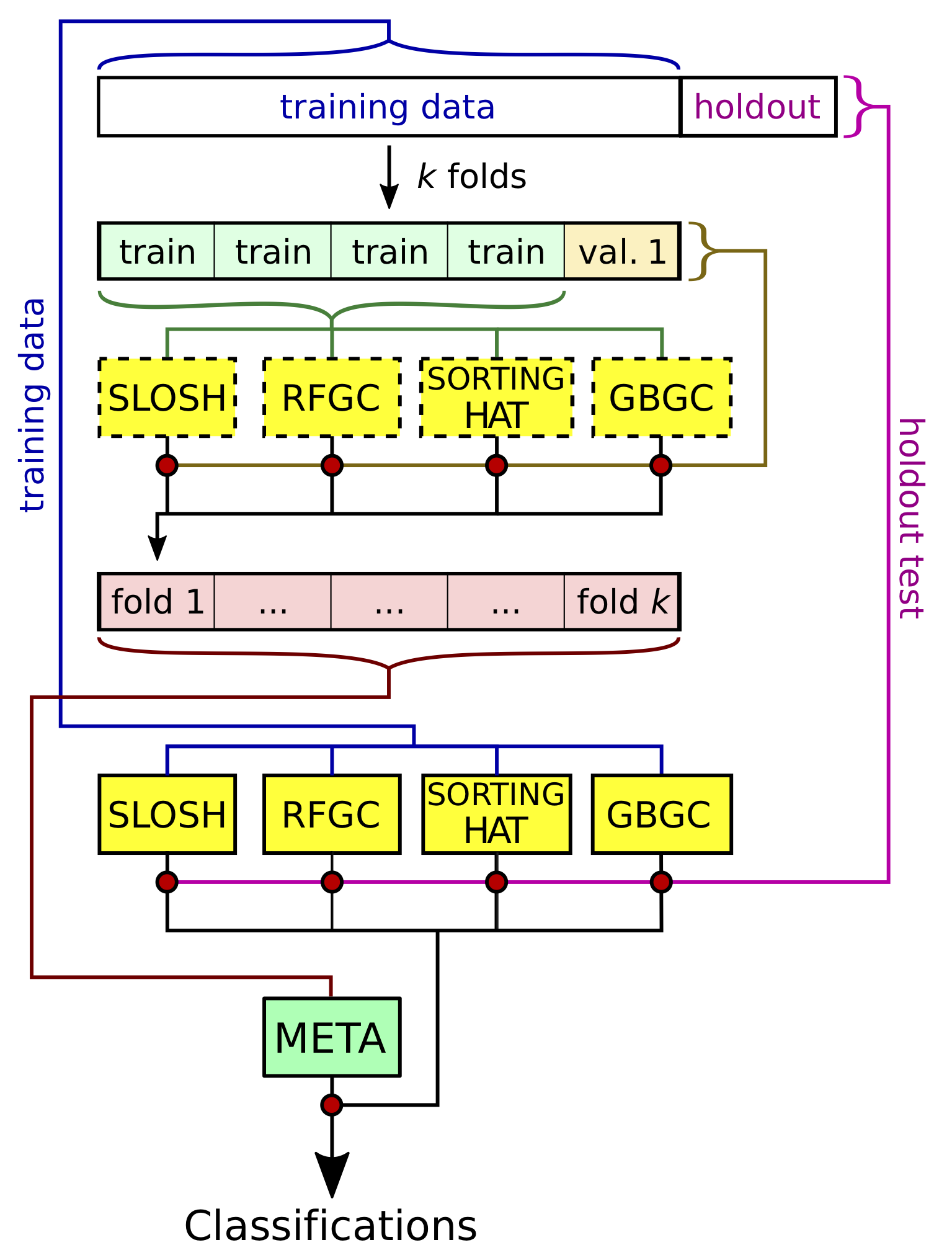
Over the last couple of years I’ve been contributing to an effort of the TESS Asteroseismic Science Consortium to classify the variable stars observed by TESS with machine learning. I’m really enthusiastic about our ensemble approach to classification, which feeds predictions from many different classifiers to a “metaclassifier” to make final predictions. I made the diagram below to demonstrate how we train and test our individual and meta-classifiers, from our upcoming paper (Audenaert et al., in prep.).
One of these classifiers, SLOSH, is the image-based classifier from Marc Hon. I spent a little time digging into this classifier at a workshop and want to share the developments I made to speed up the generation of images considerably, and to improve how well they encode the information we want to learn from.
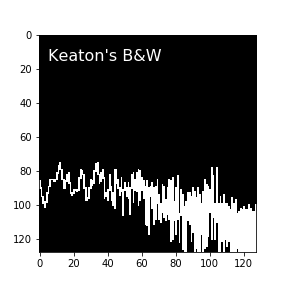
The original approach of the method was to plot a power spectrum with matplotlib (in log-log space, without axes), save it to disk as a png file, then read it back in as a 2D image and rescale it to 128x128 pixel size. The big slow-down here is having to write the images to disk and read them back in. Inspecting the images, I was surprised to find that they seem to contain some undesired image artifacts of this process: there is a useless empty border along the edges of each image, as well as some grey values in otherwise black-and-white images that appear to come from both the PNG conversion process and later image rescaling. These bits of grey concerned me as they seemed uncontrolled and could potentially cause a loss of information in the images, though clearly not enough to derail the classifier, which still was overwhelmingly successful. Still, they weren’t what I imagined an ideal image representation would look like, so I coded up an alternative.
Here’s an example of one of the original images that SLOSH classifies from.
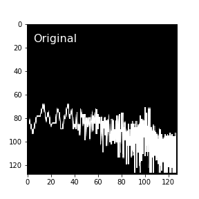
See how the data don’t go all the way to the edge, and how the lines can appear a little blurry? To me, it would seem the ideal image representation of a plot would have values of 0 in every pixel the plot lines pass through, and values of 1 in untouched pixels.
Here’s the log-log power spectrum line plot displayed over a 128x128 grid of pixels.
Since these lines are plotted in sorted order, every pixel between where the line enters and exits a column is touched by the line and should be colored in. And of course we extend out to the local maxima and/or minima within each bin if they fall outside that range.
Here’s my function to do this. It also has the option for “supersampling,” where a higher-resolution image is computed, and then averaged down to a smaller grayscale image that represents the relative density of plot lines. Without supersampling, the images are strictly black and white.
import numpy as np
from scipy.interpolate import interp1d
from scipy.stats import binned_statistic

#Little helper function that squeezes values to be in some range
def squeeze(arr, minval, maxval, axis=0):
    #array is 1D
    minvals = np.ones(arr.shape)*minval
    maxvals = np.ones(arr.shape)*maxval
    #assure above minval first
    squeezed = np.max(np.vstack((arr,minvals)),axis=0)
    squeezed = np.min(np.vstack((squeezed,maxvals)),axis=0)
    return squeezed

def plot_to_array(x, y, nbins = 128, supersample = 1,
                  minx = np.log10(3.), maxx = np.log10(283.),
                  miny = np.log10(3.), maxy = np.log10(3e7)):
    """
    Produce 2D image array representation of a line plot for machine learning

    returns nbin x nbins image-like representation of the data

    x,y data will be sorted by x before plotting

    min/max x,y define the array edges in same units as input data

    if supersample == 1, result is strictly black and white (0s and 1s)

    if supersample > 1, returns grayscale image represented as "image" density.
    """
    #make sure integer inputs are integers
    nbins = int(nbins)
    supersample = int(supersample)

    #Set up array for output (zeros outside of lines for now to aid supersampling)
    output = np.zeros((nbins,nbins))

    if supersample > 1: #Super-sample
        #Call yourself and flip orientation again
        supersampled = 1. - plot_to_array(x, y, nbins = nbins*supersample,
					  supersample = 1, minx = minx,
					  maxx = maxx, miny = miny,
                                          maxy = maxy)[::-1]
        for i in range(supersample):
            for j in range(supersample):
                output += supersampled[i::supersample,j::supersample]
        output = output/(supersample**2.)
    else: #don't supersample
        #Define bins
        xbinedges = np.linspace(minx,maxx,nbins+1)
        xbinwidth = xbinedges[1]-xbinedges[0]
        ybinedges = np.linspace(miny,maxy,nbins+1)
        ybinwidth = ybinedges[1]-ybinedges[0]

        #Resample at/near edges of bins and at original values
	#offset to ensure inclusion in lower-x bin
        smalloffset = xbinwidth/(100.*supersample)
        interpy = interp1d(x,y)
        yatedges = interpy(xbinedges)

        #Sort
        xsamples = np.concatenate((x,xbinedges,xbinedges-smalloffset))
        ysamples = np.concatenate((y,yatedges,yatedges))
        sort = np.argsort(xsamples)
        xsamples = xsamples[sort]
        ysamples = ysamples[sort]

        #Get maximum and minimum y in each bin
        maxybin = binned_statistic(xsamples,ysamples,statistic='max',bins=xbinedges)[0]
        minybin = binned_statistic(xsamples,ysamples,statistic='min',bins=xbinedges)[0]

        #Convert to indices of binned y values
        #Fix to fall within plot range
        minyinds = np.floor((minybin - miny)/ybinwidth)
        minyinds = squeeze(minyinds, 0, nbins).astype('int')
        maxyinds = np.ceil((maxybin - miny)/ybinwidth)
        maxyinds = squeeze(maxyinds, 0, nbins).astype('int')

        #populate output array
        for i in range(nbins):
            output[minyinds[i]:maxyinds[i],i] = 1

    #return result, flipped to match orientation of Marc's images
    return 1. - output[::-1]
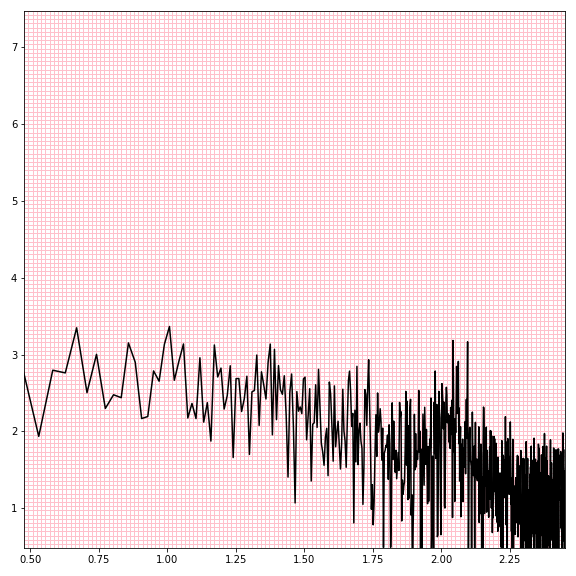
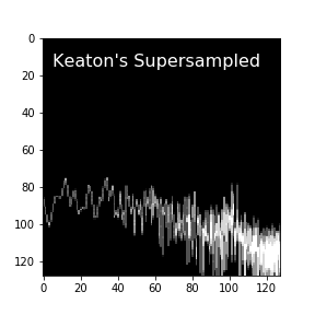
Here’s a non-supersampled, black-and-white image
and one supersampled by a factor of 4.
These numpy array representations consume less memory, and they skip the process of being written and read from disk, which makes the new approach faster and much more parallelizable.
Comparing again to the original image used for deep-learning classification of this star’s power spectrum, I believe the intentional control over how the array is constructed from the data better preserves the data fidelity, potentially improving classification performance.
This new implementation is now being used in our large-scale TESS classification effort. It was fun to work out, and I think it may be useful for other attempts to utilize deep learning for astronomical data classification. If you do find it useful, I’d be very interested to hear about your application!
Astronomy, statistics, programming in Python, data visualization, data science, and other great icebreakers.
- Bootstrapping a significance threshold for periodogram analysis
- How data sampling affects the Fourier transform periodogram
- Three statistical tests for average spacing among numbers
- Confidence intervals for 2D Gaussian mixture models with contours
- What's the expected average value of a noisy amplitude spectrum?