Three statistical tests for average spacing among numbers
The problem I’m interested in today is whether a set of values is distributed such that there is some regularity in their spacing, and how to identify that average spacing. This may be an incomplete set of measurements belonging to an evenly spaced pattern, in the way that 16, 17, 19, 23, 24, 28 belong to a set of numbers evenly spaced by 1. The values may not be strictly evenly spaced, and they may deviate from an even average spacing. The set of numbers could contain a mix of values, only some of which follow an even spacing.
This situation comes up a lot in my research on white dwarf pulsations. The periods of gravity-mode pulsations of white dwarfs are mostly expected to follow a pattern of even period spacing as part of an overtone series, though individual periods will deviate from that average pattern. And only a subset of mode periods are typically detected. Structure in these measurements is rarely so obvious that it jumps right out at you, and so it is common in the field to employ three statistical tests for mean period spacings: the Inverse Variance test (O’Donoghue 1994, MNRAS, 270, 222), the Kolmogorov-Smirnov test (Kawaler 1988, Advances in Helio- and Asteroseismology, 123, 329), and the Fourier Transform test (Winget et al. 1991, ApJ, 378, 326).
I will introduce and explain how each of these tests works. While they’re fairly straightforward, I haven’t found a clear description of the methods that I like. All three tests are doing something quite similar, if not obvious at first glance. Conventional wisdom is to use all three to ensure that they all report the same average spacing.
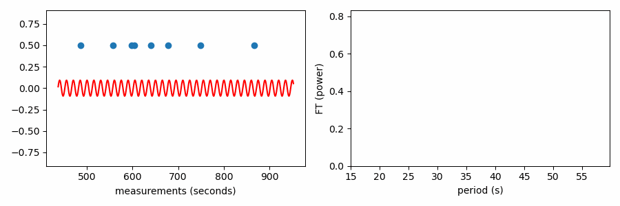
These tests were all used in the analysis of pulsations measured from the TESS spacecraft of the white dwarf WD 0158-160 (Figure 3), where they all supported a mean period spacing of 38.1 seconds between measured pulsation periods of 485.527, 557.649, 597.554, 604.642, 640.533, 678.433, 749.27, and 865.97 seconds. I’ll use those values for this demonstration. I keep the code in the post at a minimum, but the functions to apply these tests for mean period spacing are available on GitHub here.
Searching for Periodicity
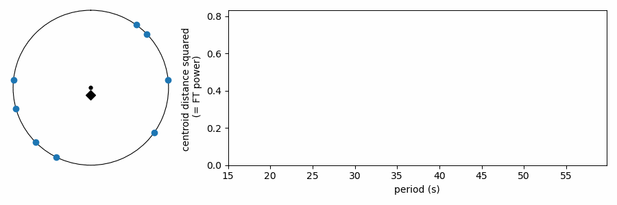
All three methods are applied to a range of possible spacings, evaluating how much each spacing appears to be present compared to other spacings that were tested. And all three tests start somewhere similar, essentially wrapping the values of interest on a number line at each test period. This puts the values in “phase” from zero to one, folded on the test period. We aim to see if values tend to clump together, suggesting that values line up on the test period, or they spread out all over in phase when the test period does not describe underlying structure in the data. For a set of values you want to find periodicity in, like the pulsation periods above, you can wrap the values on a test period, \(p\), using the modulo operator, which in Python is the \(%\) symbol. The modulo operator returns the remainder after division, so 28 % 5 = 3, because 5 goes into 28 five times with a remainder of 3. Dividing by the test period forces the range of values to go between 0-1.
# wrap values on test period, between 0-1
phase = (values % testperiod)/testperiod
Graphically, the phase can be represented on a polar plot with angles ranging from \(0\) to \(2\pi\). Here we show how the example values above wrap around the numberline on two different test periods.
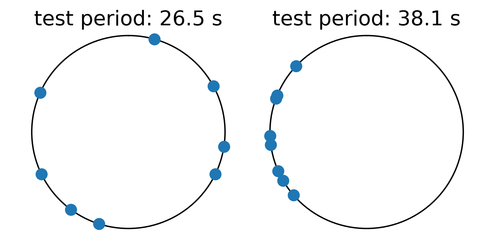
On the left, values are somewhat randomly distributed in phase for a test period of 26.5 seconds, indicating that the the values do not align on this periodicity. On the right, however, values clump together in one part of the phase diagram, suggesting that they do align somewhat with a spacing of 38.1 seconds. While all three methods essentially convert values to phases wrapped on test periods in search of values concentrating more in phase on periods that are present in the data, the three methods differ in how they quantify how bunched up the values are in phase.
Inverse Variance Test
The easiest to understand is the inverse variance test. With values wrapped on a test period, we want to know how concentrated vs spread out these values are in phase. That’s the kind of thing that the variance measures! Variance is the average squared difference from the mean. The inverse of the variance is large when the variance is small, and small when the variance is large.
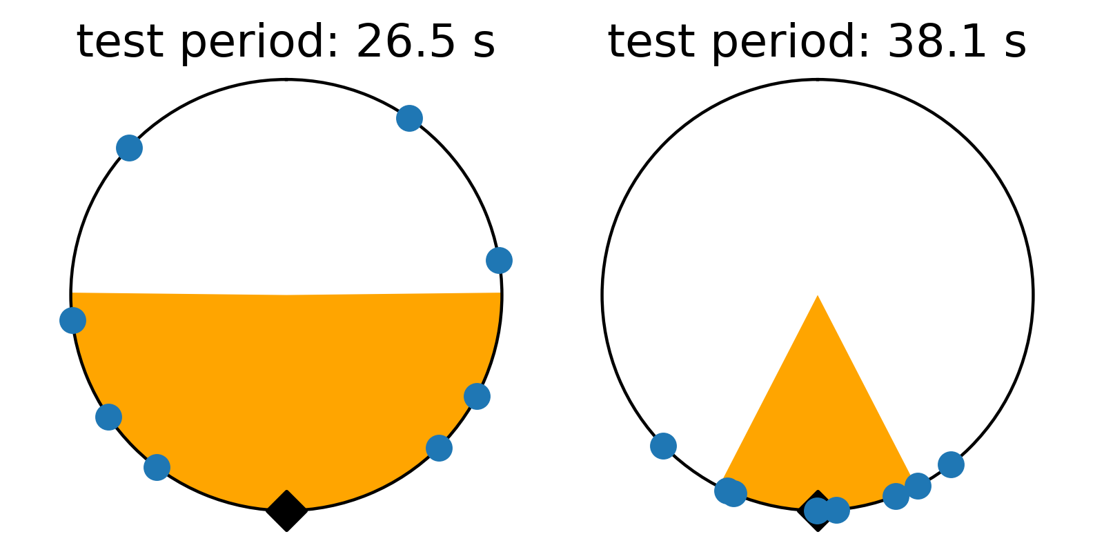
There’s just one gotcha before we ask numpy to compute the variance… there’s a pesky boundary on our numberline where values wrap discontinously from one back to zero. Calculating the variance across this boundary produces results that are difficult to interpret. To avoid this, we can shift all the numbers in phase so they’re centered on average around 0.5, and we compute the variance relative to this mean value that is as far from the 1-0 boundary as we can get. Even that’s not trivial, because taking the mean of numbers that cross the 1-0 can yield confusing results. I estimate phase angle by computing the angle of the vector average location of values on the polar plot. Centering on the angle of this average vector (marked with a black triangle), we get the plots below. These are displayed like a clock, with the 1-0 boundary at 12:00, so we force the average to be at 6:00 on the bottom of the circle. The points have been rotated to this orientation below, and the orange color shades one standard deviation (square root of the variance) to either side of the average. We see how this metric measures the concentration of values in phase on the test period.
Testing a range of periods that could be present in the data produces a periodogram comparing concentration as a function of test period.
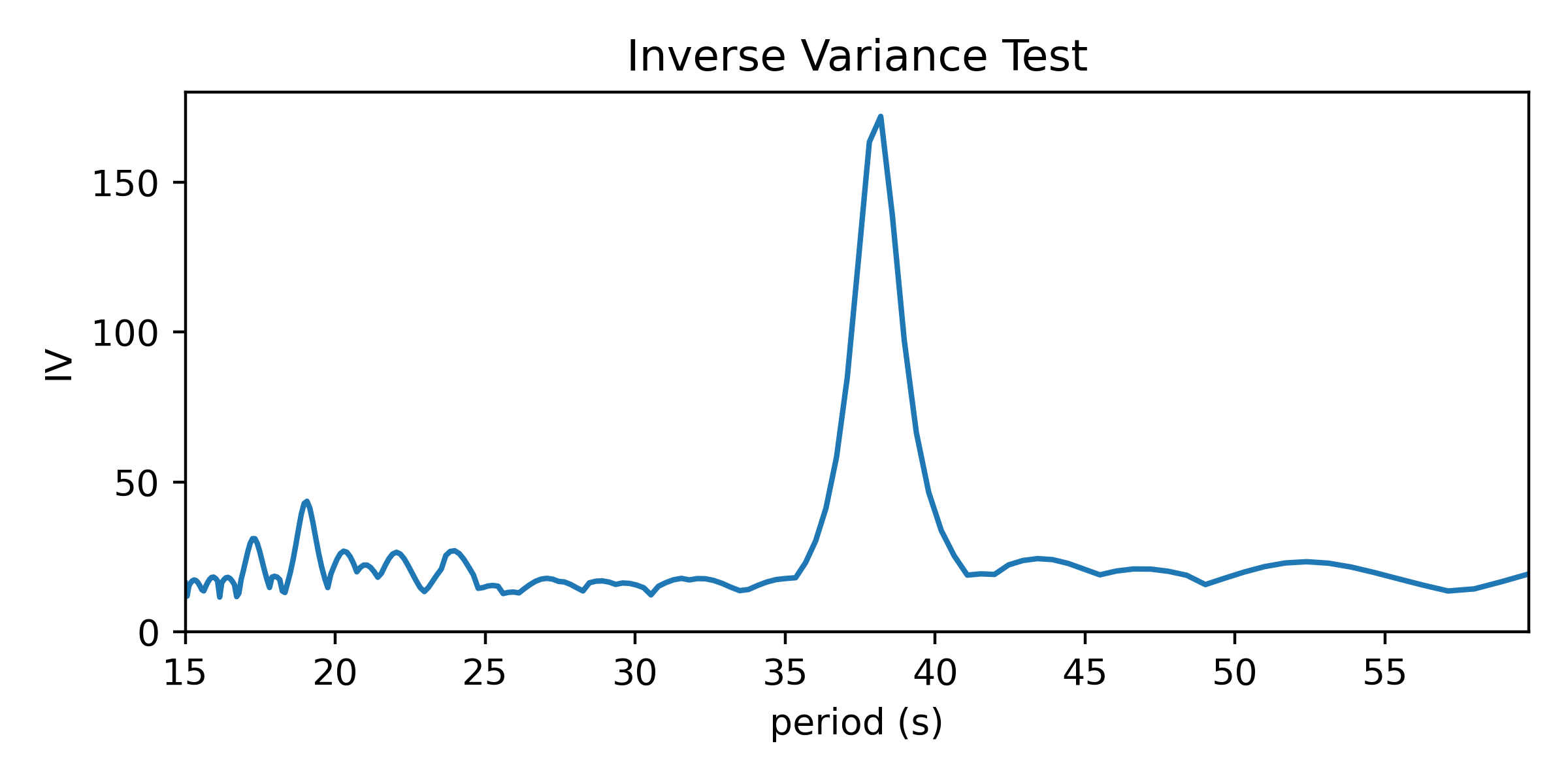
This reaches a peak value near 38 seconds, where we saw values clumping together in the right-side panels of the figures above.
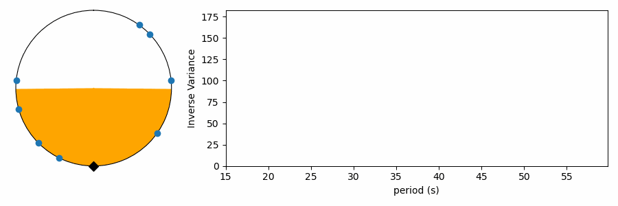
At the risk of just completely overdoing it, here’s an animation with a graphical representation of inverse variance as a function of test period, showing how this IV periodogram is calculated for the full range of periods considered.
Kolmogorov-Smirnov Test
The K-S test is something anyone doing statistics should be familiar with. It tests how consistent a set of values is with being drawn randomly from a given distribution, or it can be used to test whether two sets of numbers are consistent with being drawn from the same underlying distribution. We do the former here, comparing our phase-wrapped values to a uniform distribution between 0 and 1. If our test period does not cause values to concentrate in phase, they should be more or less randomly distributed as if they were drawn from a uniform distribution. We call the idea that these values are consistent with being random values the “null hypothesis.” If the distribution in phase is not consistent with a uniform distribution, we can reject the null hypothesis and claim that there is structure at the test period.
The K-S test makes this assessment by comparing cumulative probability distributions (CDF). This is like an integrated histogram, but without any binning. The cumulative distributions for values wrapped on two different test periods are shown below. On the left the distribution of values follows expectations for a uniform distribution (dashed red line) quite well, while values are concentrated in phase again on the right side. The top panel shows the difference (“residuals”) between the data CDF and the comparison distribution (uniform). The K-S statistic reports the greatest difference between these two curves, marked with a light green line segment in the plot. The larger this line segment, the greater the difference between the values and the comparison distribution, and the more likely we are to reject the null hypothesis.
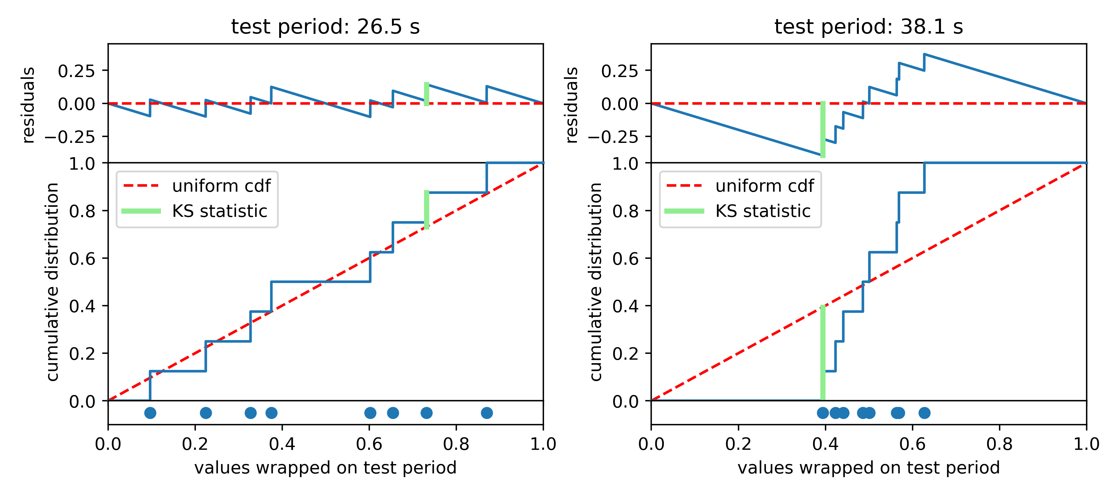
In Python, K-S tests can be performed with \(scipy.stats.kstest\). It returns two useful numbers: the “statistic” is the greatest difference between the CDFs; the “p-value” describes how consistent the CDFs are with each other, accounting for the number of values being compared. Following Numerical Recipes, we call the latter Q and we plot the log of it versus periods tested. Compelling period spacings are identified as minima in log(Q).
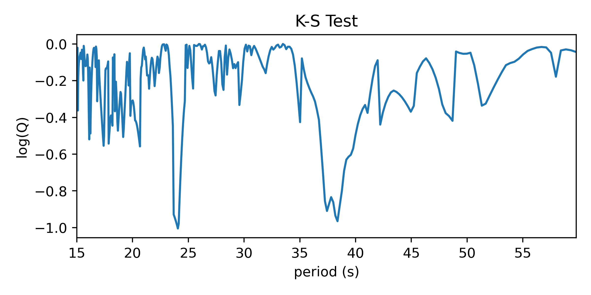
This one seems noisier than the results of the Inverse Variance test. It’s more statsy, but less interpretable in my opinion. It isn’t strictly measuring regularity of the values, but rather I aims to reject the notion that the values are distributed uniformly when folded on test periods. The biggest dip is at around 24 seconds, which did not match a peak in the IV test.
Here’s an animation showing what happens under the hood to compute a K-S spectrum for average spacings.
Fourier Transform Test
Finally, the Fourier Transform test. I’m way into Fourier transforms, but if you’re used to applying them to time series data, it may not be immediately evident how to apply the FT to this problem. A Fourier transform is often used to reveal variability in time series data by transforming the data into the frequency domain. There, time domain variability shows up as one or more significant peaks in a graph of the Fourier transform. Essentially, the Fourier transform shows the best-fit amplitude (or power = amplitude^2) of a sinusoidal signal at each frequency sampled by the periodogram.
The Fourier Transform test for structure in the spacing of a set of values is similar to how one computes a “spectral window” for time domain data. I wrote about this a bit in my post on avoiding frequency aliases. A spectral window represents how the way a signal is sampled in time introduces aliases to the Fourier transform. By taking the Fourier transform of a series of a constant values sampled in time identically to your data set (the “window function”), you reveal the signature shape to expect in the frequency domain from a sinusoidal signal in the data. Structure in the timestamps will cause power at non-zero frequencies in the spectral window.
Similarly, structure in any set of values could be uncovered by such a procedure. If we treat the values we want to find structure in as our timestamps and associate a constant positive value to each (0.5 in plots below), we can compute the Fourier transform to identify periodic structure. If there is an even spacing among the values, a sine wave centered on zero with a matching period will fit best by reaching up toward our data points. If the period doesn’t match, positive parts of the sine wave will want to reach toward the data points, but this would come at the great cost of a negative part of the sine wave moving further from other data points; such a sine wave would have a relatively small best-fit amplitude.
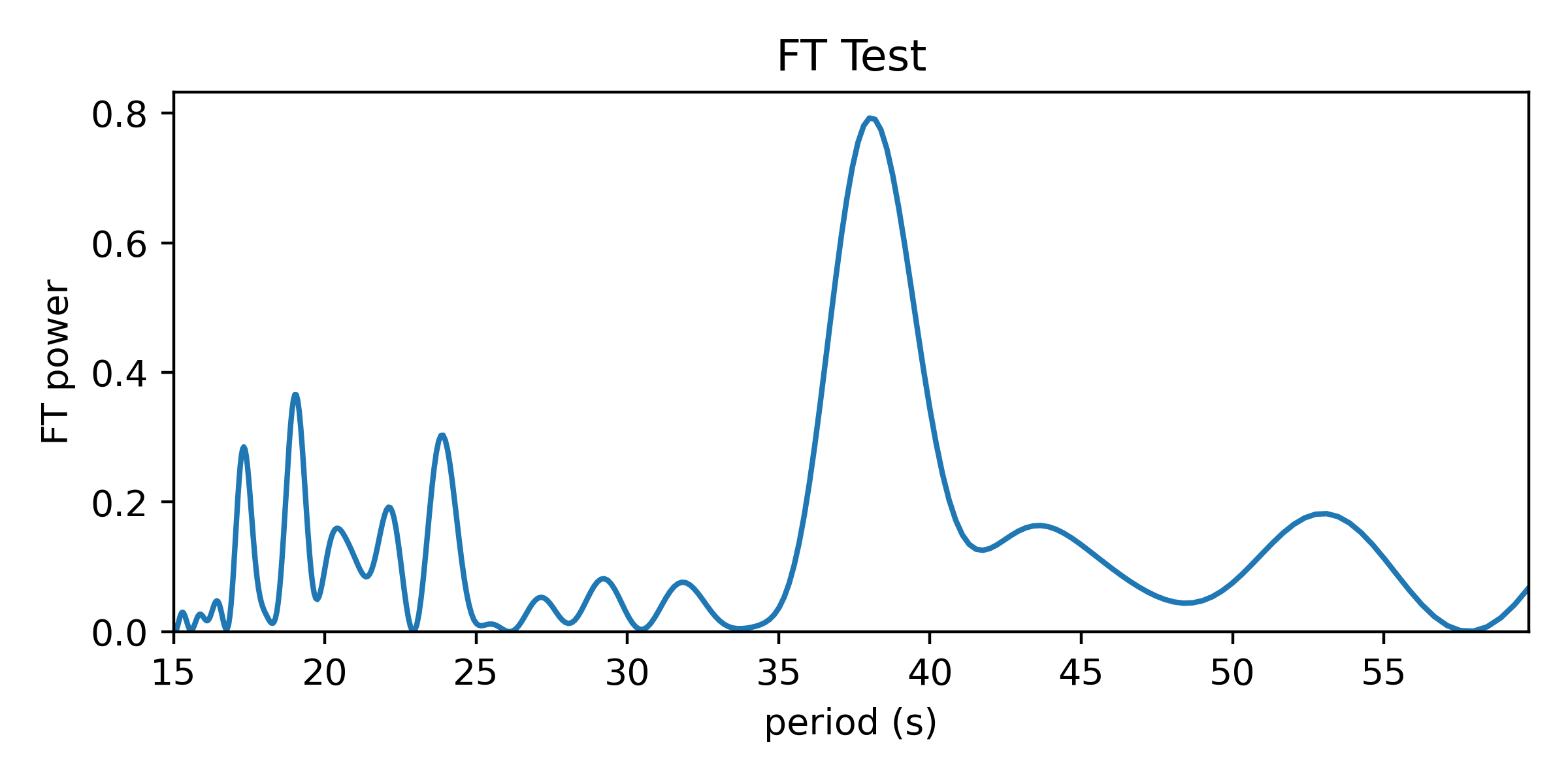
Here’s the periodogram that results from the Fourier Transform test:
And here’s an animation showing how the FT power relates to the best-fit amplitude of a zero-centered sine wave to our set of values. Power is the best-fit amplitude squared.
As it has been shown here, this test appears to be doing something different from the other tests, which wrapped our values in phase on a number line. In reality it is quite similar, as the FT is considering how the periodic sine wave phases up with our data. It turns out that fitting sine amplitudes to our values is mathematically equivalent to computing the distance of the average position of the values wrapped on the number line. See for yourself:
The Python code to apply these tests for mean period spacings is available on GitHub here. If you find the code or this blog post useful to your work, an acknowledgment is always appreciated.

Astronomy, statistics, programming in Python, data visualization, data science, and other great icebreakers.
- Bootstrapping a significance threshold for periodogram analysis
- How data sampling affects the Fourier transform periodogram
- Three statistical tests for average spacing among numbers
- Confidence intervals for 2D Gaussian mixture models with contours
- What's the expected average value of a noisy amplitude spectrum?